Jusan Family: 200K kids’ cards in 3 months
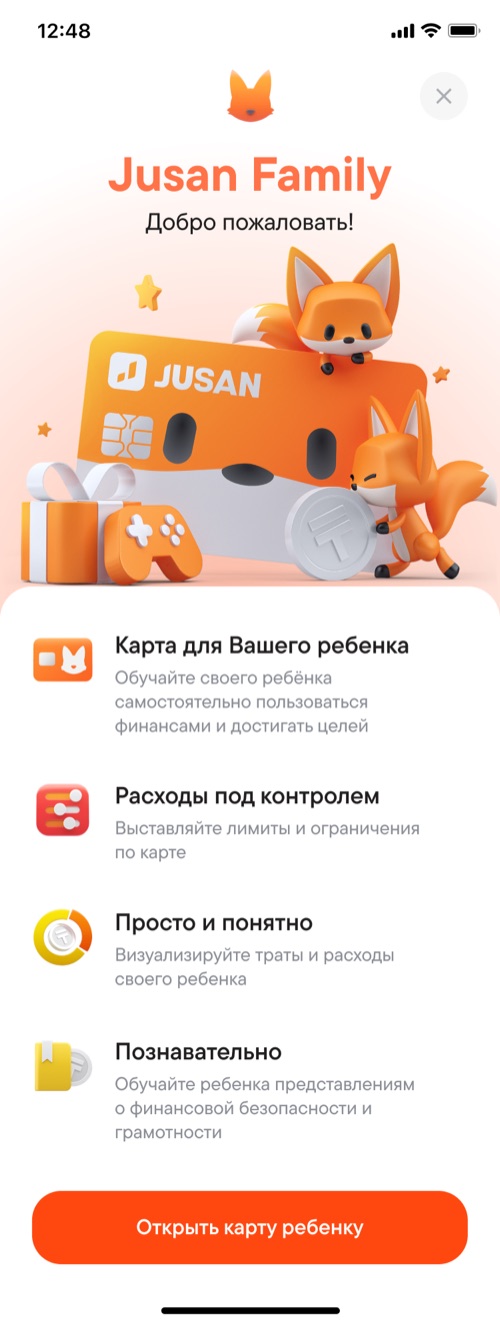
kids’ cards in 3 months
the age range the card is for
from idea to launch
Context. Jusan was looking for a way to stand out in the market and built a card for kids.
We wanted to make more than just a card — a tool that teaches kids how to handle money from an early age. The design team lead did the visuals, 3D and animations, and all of the UX and product logic was on me.
Mechanics. Tasks from parents and savings goals teach kids how to handle money.
- Tasks. A parent sets a task, like “clean your room”, and assigns a reward.
- Goals. The child chooses what to save for, and the parent approves it so the goal is realistic: at 6, it’s easy to want a Lamborghini.
- Ask for money. If there isn’t enough, the child asks for the amount they need, with a comment.
- Their own card design out of 5 options. A card the child picked themselves already feels like theirs.
Two flows. Almost every action the child takes meets an action from the parent — from the QR code to getting paid for a task.
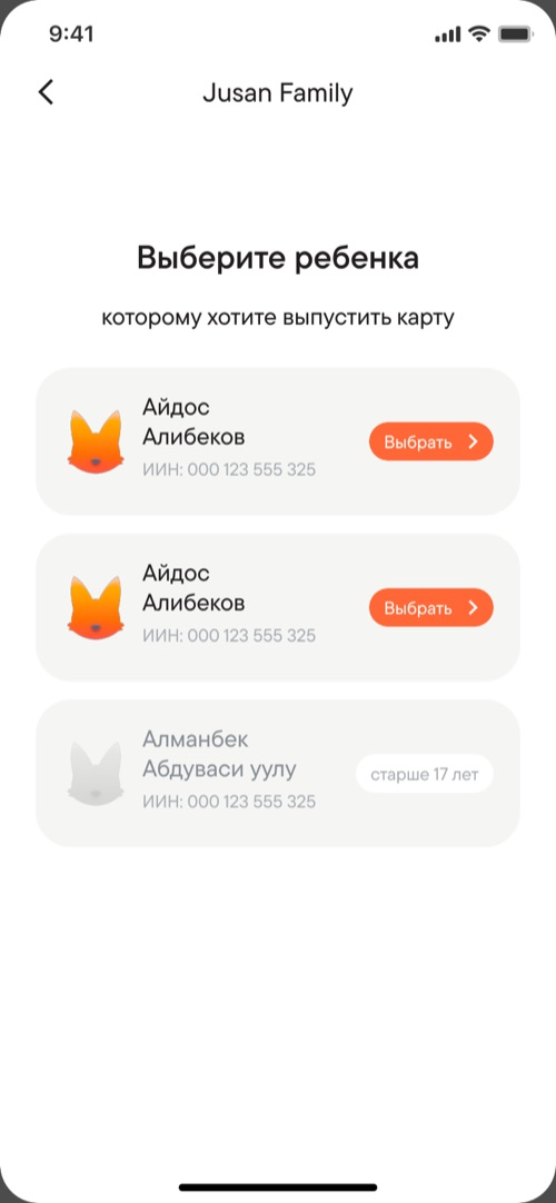
Picks the child: the list is pulled from the government database
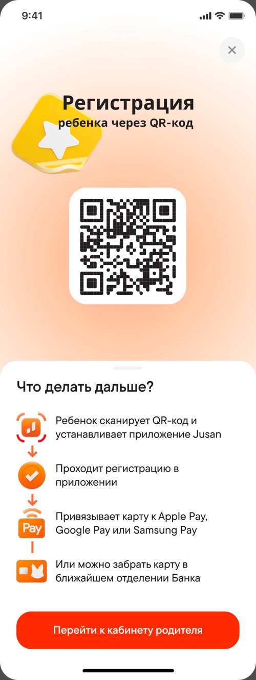
Shows a QR code or sends a link
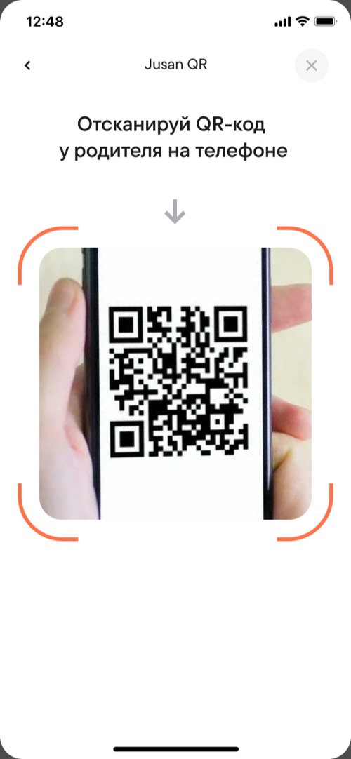
Scans the code, downloads the app and logs in
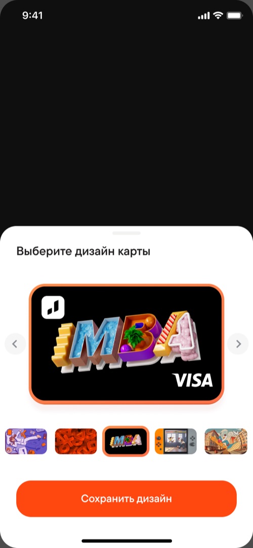
Picks a card design out of 5 options

Sets a task and a reward
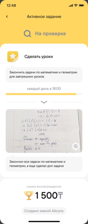
Completes it and sends it for review
Approves — the money lands on the card
Approves it if the goal is realistic
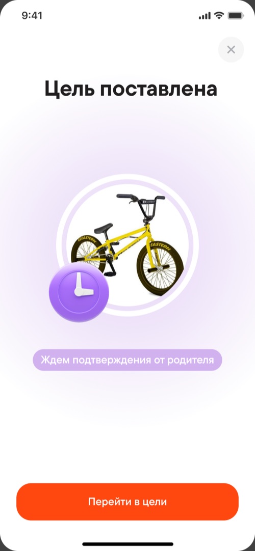
Sets a goal — it waits for approval
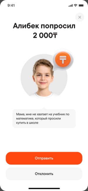
Sees the request and sends the money or declines
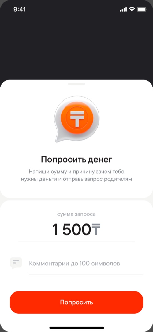
Asks for the amount needed, with a comment
Sets spending limits and automatic top-ups
Child sign-up. It all starts with the parent: the list of children is pulled from the government database.
- The parent opens child sign-up — nothing needs to be entered by hand.
- Children under 6 and over 17 are shown too, but they can’t be selected, with an explanation of why right next to them.
- The parent sends a link or shows a QR code. The child scans it and logs in.
Timeline. From idea to launch in 2 months: design and backend ran in parallel.
I sketched the logic, and the backend team built on it right away. Once the child sign-up flow was ready, the frontend team joined in.
A mistake. Mobile wallets are only available from age 13, but we opened the card from age 6.
To save costs, the card was virtual-only at first, so younger kids couldn’t pay with it. We had to issue physical cards.
Result. 200K kids’ cards in 3 months.
- The launch was backed by influencer ads; at the time, the bank had 2–3 million customers.
- A great response: parents posted stories on their own, mostly with positive reviews.
What I learned. A kids’ product is built for two people: the child and the parent.
The child uses it, but the parent decides and sets things up. Designing two flows that come together in one product was the hardest part — and it taught me the most.