Freedom’s design system from scratch in 2 weeks
from first sketches to a UI kit
of components — from buttons to OTP
in use with almost no changes
Problem. Designers copied elements from each other’s mockups, and the same element looked different everywhere.
Colors were named with numbers from 100 to 900, and it wasn’t clear which one to use where. In an hour, I sketched a couple of components and showed them to the lead. He agreed — as long as it was fast.
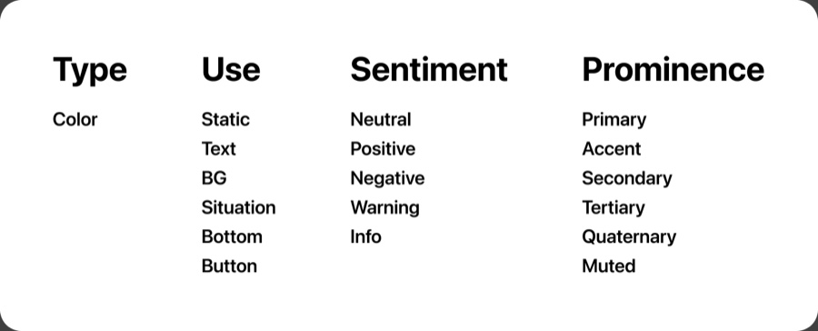
Tokens. Instead of “green 500” — a name that tells you where to use the color.
| Part | Meaning | Values |
|---|---|---|
| Type | resource type | Color |
| Use | where it’s used | Static, Text, BG, Situation, Bottom, Button |
| Sentiment | meaning | Neutral, Positive, Negative, Warning, Info |
| Prominence | how prominent | Primary, Accent, Secondary, Tertiary, Quaternary, Muted |
For example, color.text.negative.primary is the main color for error text. Designers no longer have to remember which red is the right one.
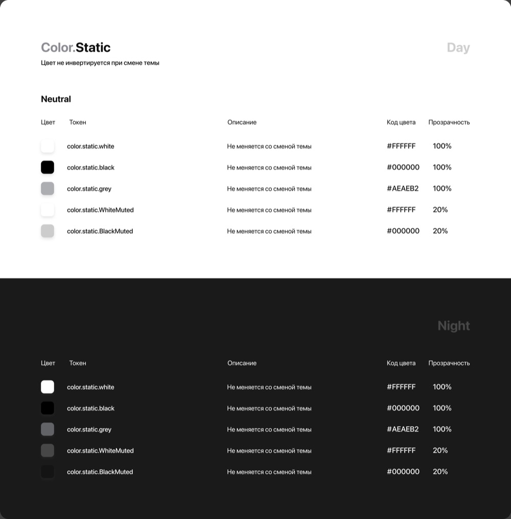
Dark theme. Built in from day one: every token has a value for day and for night.
When the theme switches, the colors change on their own. A separate Static group holds colors that never change: white, black, gray.
Components. 27 groups: from buttons to OTP and video identification.
Buttons, cells, inputs, navbars and banking-specific pieces like limits, OTP and widgets.
- Alert
- Banner
- Bottom sheet
- Buttons
- Calendar
- Cell
- Chip & Filter
- Controls
- Counter
- Inputs
- Info blocks
- Limits
- Navbar
- Placeholder
- Progress
- Scan
- Search
- Services
- Status pages
- Status tags
- Stories
- Tabs
- Tab Bar
- Toast
- OTP
- Video Identification
- Widgets
Banking components: limits, OTP, video identification, widgets
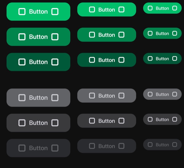
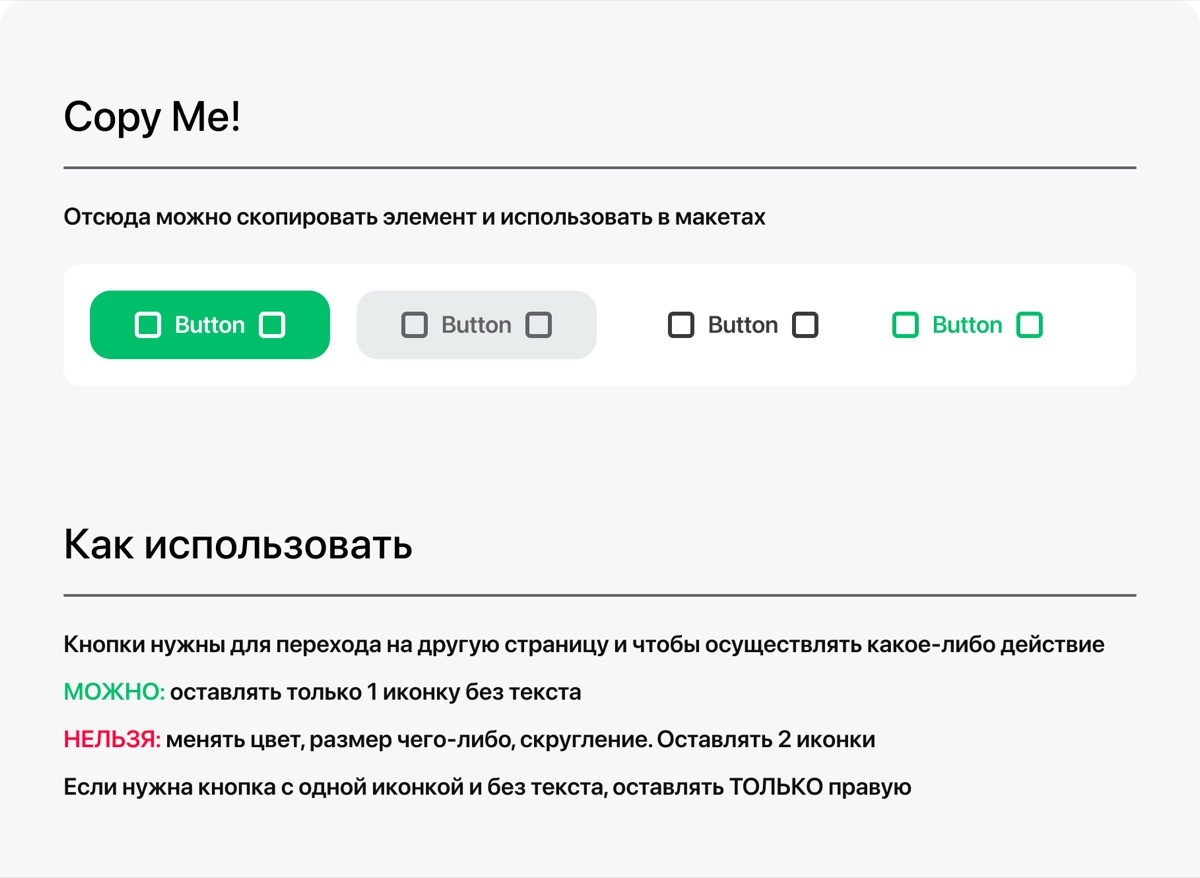
Documentation. Complex components come with a guide: what’s allowed, what isn’t and how to use them in a mockup.
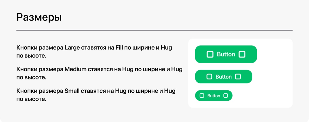
Every page has the same structure: a component you can copy, usage rules, all the settings and sizes. Here’s what it looks like for the button.
Result. More than 2 years in use with almost no changes.
- Built from scratch in 2 weeks of focused work.
- More than 2 years in use: colleagues say the system is still in use today.
- Light and dark themes from day one.
What I’d do differently. I’d drop the extra part of the token name and build larger components.
- Type is redundant. If there’s only one type — Color — it adds nothing to the name.
- Too atomic. In theory it’s flexible; in practice, such components are harder to use.
But the system did its main job: designers stopped copying elements from each other, and the Arbuz team, which Freedom was integrating into the super app at the time, got a clear set of components.